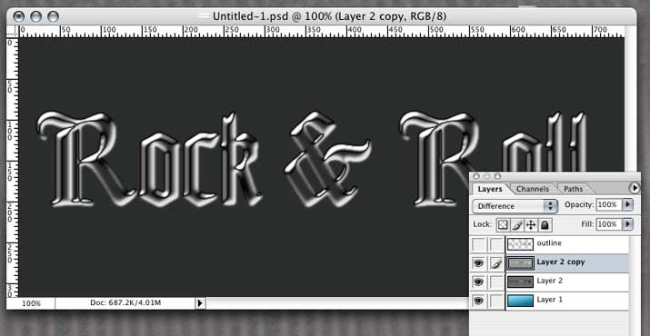
8. Duplicate The fill layer we created in step 7 by dragging it to the new layer icon at the bottom of the layers palette. Press command-i (control-i pc) to invert the image of the new, duplicate layer then set the blend mode popup for this layer to difference. This screen shot shows our image after we set the blend mode to difference. You can see that I've turned off the visibility of the outline layer on top so we can see the layer we're working on.
9. With the layer 2 copy still active, choose Merge Down from the Layers menu to merge the two type fill layers into a single layer. Now load the channel "original" as a selection by command-clicking (control-click pc) on it in the channels palette. Invert the selection by typing command-shift-i (control-shift-i pc) then hit the delete key to delete the background from the type fill layer. With the visibility of the top outline layer turned back on. our image now looks like this.
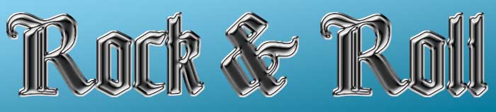
10. Now we've got kind of a dull-polished steel look. We could stop here, but let's keep going a bit. We can add some color to give it a different look. From the Image menu, select Adjustments-->Hue/Saturation... Check the Colorize check box. This will color the type a pale red. You can change the color by moving the Hue slider. This will cycle through the color wheel. Move the Saturation slider to the right to increase the intensity of the color you choose. You can choose a gold or a copper shade, or go for something less realistic. Here's our type after we've added some color.

11. We just have a couple of finishing touches to add. Merge the outline layer with the type fill layer. Now add a drop shadow layer style to this layer. Click on the color swatch in the drop shadow layer style dialog to bring up the color picker. Click inside your type to set the color picker to your type's color, then choose a dark shade of that color to use as a drop shadow color.

12. Last, we'll add some lens flare/sparkles to the letters. Select the paintbrush tool and push the airbrush mode icon in the tool options bar. In older verions of Photoshop, select the airbrush tool in the tool palette. In the brushes palette choose a 1 pixel brush, check the Other Dynamics checkbox and set the Opacity Control to Fade. Enter about 60 for a fade value. Now click the new layer icon on the Layers palette. Make sure this new layer is the top-most layer. Turn off the visibility of the type layer so we can easily see what we're doing. Click near the center of the image and drag to the right while holding down the shift key to constrain the brush to a straight line. The brush will fade to transparent at 60 pixels. The screen shot below shows our first stroke.

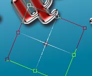
Now align the brush on the beginning of the first stroke and click and drag straight down while holding the shift key. This gives us an arm perpendicular to the first arm as pictured. Repeat this step twice more painting an arm to the left and finally, an arm going up, giving us a four armed cross shape. Under the Edit menu choose Transform-->Rotate. Click and drag, rotating our flare to the right. I angled this one about 30 or 35 degrees.
Turn the visibility for the type layer back on. With the Move tool, drag the sparkle to a specular highlight area along the edge of the type somewhere and release it. Now hold down the option key (alt key pc) and click on the sparkle again and drag. This creates a copy of it on a new layer. Drag this copy to a different highlight location along the edge. Continue this process, placing several copies randomly across the type. After you've made two or three copies, you may want to merge all but the last one (which you'll want to make the next copy from) to keep your document size down.
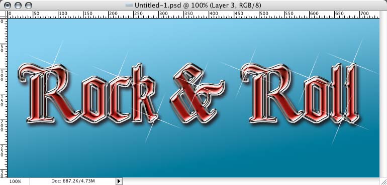
After placing a few lens flare/sparkles we're done! Our finished type is pictured below. It's beautiful!

| Back | 1 2 3 | Next |
| Back to Photoshop FX | Back to Photoshop main | ||